A version of this first appeared in the Viget blog.
Agency front-end development (FED) teams face unique challenges because of the wide variety of work they have to support. Work that spans many different technologies, from singe page applications (SPAs) to Craft CMS driven content sites to native apps. Working on a wide range of technologies, and jumping from project to project, has its advantages—you won’t get bored—but it comes with drawbacks as well:
- Context switching is hard,
- Picking up someone else’s code with little or no ramp-up time is difficult, and
- We have to be fast, maybe every front-end developer (FED) needs to be fast, but we have to be faster. We typically join projects as MVP concepts, projects at the moment they are trying to push something to the finish line, or projects with small budgets with big ambitions.
How we structure our CSS has to be in service of alleviating the pain points of agency front-end development work. What Adam Wathan describes in his article CSS Utility Classes and “Separation of Concerns” matches our thinking. For the past decade, we have tried “semantic” CSS and having a clear “separation of concerns” between our HTML and our CSS. We’ve also spent time writing generic CSS components with additional classes. We have used traditional BEM and then BEM with sassier modifiers. The latest iteration of our process is a utility-first approach to writing CSS with Tailwind. For the past two years we’ve found it to be the most maintainable, accessible, and fast way for us to write CSS.
Jump to heading Disambiguating Tailwind
Tailwind is many things to many people, so it’s important to know what we mean when we say we: “have settled on a utility-first approach to writing CSS with Tailwind”. There could be a whole article written about the many flavours of Tailwind, but broadly speaking those flavours are:
- Stock tailwind, ie. no changes to the configuration,
- Tailwind that heavily relies on
@applyin CSS files but still follows BEM or some other component organization, - Tailwind UI, and
- heavily customizing Tailwind’s configuration and writing custom plugins.
What we mean when we say we use Tailwind is option 4 above.
Jump to heading A quick overview of the evolution
Before going any further let’s trace the evolution with some examples, going from how we used to write CSS to how we currently write it. This is a contrived example meant only to illustrate the evolution.
Imagine we are building a simple card component. We might write some HTML like this:
<article>
  <a href="/sample">
    <figure>
      <img src="./images/image.png" alt="">
    </figure>
    <div>
      <h3>Hello I am a card</h3>
      <p>I am this card's text</p>
    </div>
  </a>
</article>
Jump to heading BEM
With our old BEM approach we would then write some classes like this:
<article class="card">
  <a class="card__link" href="/sample">
    <figure class="card__image">
      <img src="./images/image.png" alt="">
    </figure>
    <div class="card__body">
      <h3 class="card__title">Hello I am a card</h3>
      <p>I am this card's text</p>
    </div>
  </a>
</article>
Our CSS, using PostCSS with postcss-nesting, would look something like this:
/* in some variables files (could also be sass vars) */
:root {
  /* colors */
  --gray-200: #edf2f7;

  /* border radius */
  --radius-md: 4px;

  /* spacing */
  --spacing-md: 1rem;
}

/* card.css */
.card {
  background: white;
  border: 1px solid var(--gray-200);
  border-radius: var(--radius-md);
  box-shadow: 0 1px 3px 0 rgba(0, 0, 0, 0.1);
  width: 50%;
}

.card__link {
  display: block;

  &:hover {
    background: var(--gray-200);
  }
}

.card__image {
  border-bottom: 1px solid var(--gray-200);

  & img {
    display: block;
  }
}

.card__title {
  font-weight: bold;
  text-transform: uppercase;
}

.card__body {
  padding: var(--spacing-md);
  text-align: center;
}
This could also be written using Sass or Less, we’ve used both in the past.
Jump to heading BEM with modifiers
Now we want to modify our existing card and make a “dark” variant. We add a .-dark modifier to our markup:
<article class="card -dark">
  <!-- same markup as before -->
</article>
Then we add a bit of CSS to handle our new “dark” card.
.card {
  /* same rules as before */

  &.-dark {
    background: black;
    border-color: var(--gray-800);
    color: white;

    & .card__link:hover {
      background: var(--gray-800);
    }

    & .card__image {
      border-color: var(--gray-800);
    }
  }
}
There are a bunch of ways you can accomplish this (that’s partly the problem) but generally you set modifier classes on something and that modifies your card.
Jump to heading Tailwind
In a complete departure from our previous way of doing things we moved towards a hybrid approach, writing little to no CSS at all and relying on portable custom Tailwind plugins we carry from project to project. We configure Tailwind to our liking, taking the values we use in CSS above and setting them in a tailwind.config.js file, and then apply utility classes to our original markup:
<article class="shadow bg-white rounded border-gray-200 w-1/2 overflow-hidden">
  <a class="block hover:bg-gray-200" href="/sample">
    <figure class="border-b border-gray-200">
      <img class="block" src="./images/image.png" alt="">
    </figure>
    <div class="text-center p-16">
      <h3 class="uppercase font-bold">Hello I am a card</h3>
      <p>I am this card’s text</p>
    </div>
  </a>
</article>
For our dark card variant we replace a few classes:
<article class="shadow bg-black text-white rounded border-gray-800 w-1/2 overflow-hidden">
  <a class="block hover:bg-gray-800" href="/sample">
    <figure class="border-b border-gray-800">
      <img class="block" src="./images/image.png" alt="">
    </figure>
    <div class="text-center p-16">
      <h3 class="uppercase font-bold">Hello I am a card</h3>
      <p>I am this card’s text</p>
    </div>
  </a>
</article>
In a real-world scenario we would componentize the “card” component and use something like the classnames package if we were using React or the equivalent for our Craft CMS work. These allow us to abstract components and make using variants of components easier.
So, why has this approach worked better for us? To understand that we need to understand how agency FED teams work.
Jump to heading How do agency FED teams work?
As a team we have some requirements we are looking for when adopting a new approach. The nature of our work means we have to jump into projects quickly, so minimizing the cost of context switching is key. Part of this means we need approaches that are well documented and have incredible tooling—by this I mean mostly that editor plugins exist that make the developer experience easier. Our previous approaches to CSS allowed for too much variety in the way we did things. We would “improve” things on every project, leading every project to be very different than the last. That constant change exacerbated context switching woes. Much like how Prettier removed the mental load of formatting code, Tailwind removed the mental load of CSS.
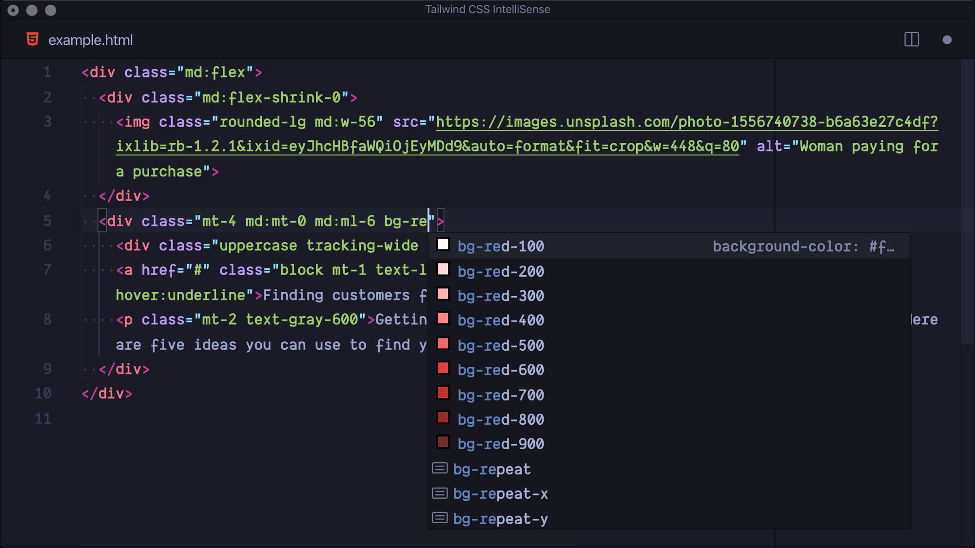
We work closely with designers and need ways to stay in sync with designs, usually in Figma. We also need a way to talk to designers about how their designs and files are translated into code. The Tailwind configuration coupled with VSCode IntelliSense has been the most efficient way we’ve ever found of translating design tokens to a configuration we can use in code.
Finally, we work with back-end developers. We need to lower the opportunity for error when non-front-end developers have to make style changes, or have to ship stop-gap measures. Usually this means, in the interest of time, a developer will use inline styles or do the best within the existing CSS set up. Neither of those solutions are great and they are both error prone. Premature abstractions make things harder since it’s unclear whether to use an existing component, make a new one, or do something else. With Tailwind, they have a configured design system to work within, minimizing (though, not eliminating) the chance for errors.
Jump to heading Tailwind addresses our needs, but that could change
Integrating Tailwind into our workflow has reduced costs associated with context switching between projects, and there’s really no bigger win than that in an agency environment. We are more productive using Tailwind the way we do than working any way we’ve tried in the past.
Just adding Tailwind to your stack won’t do much though, integrating it into your team’s workflow is key.
Jump to heading Working with designers
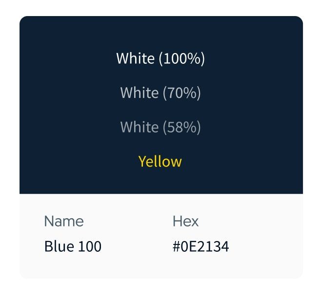
The most straightforward example of how we’ve integrated the Tailwind config with the way we generally work is with colors. Designers will have color cards like this on in Figma:

This gets translated into our Tailwind configuration:
module.exports = {
  // other configs
  theme: {
    // other theme configs
    colors: {
      // other colors
      blue: {
        100: '#0E2134',
        // other blues
      },
    }
  }
}
There are many ways to have variables in CSS from native CSS custom properties to variables in Sass. One of the main reasons we like using Tailwind for this is the tooling. Tailwind coupled with VSCode allows us to use the Tailwind CSS IntelliSense extension. This extension provides autocomplete options for all the Tailwind properties, and it is especially handy when it comes to colors.

Designers will use color styles in Figma and these color styles match classes that Tailwind creates from our configuration. The end result is a streamlined developer experience translating designs to code.
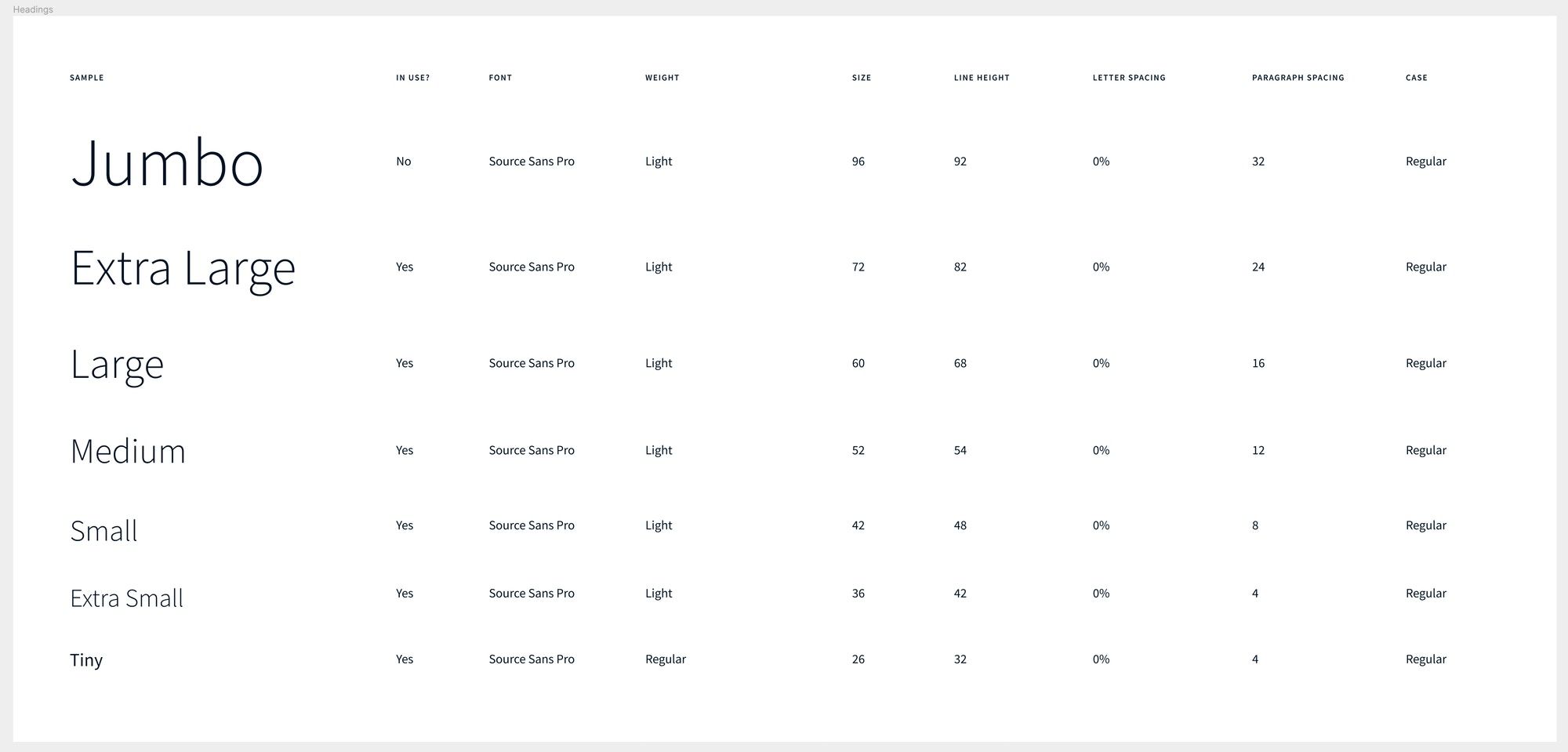
Another example is codifying and maintaining complex typography systems. Consider this typography table:

This is one of many of these tables that correspond to all the typography treatments on a site. Every page uses these styles to set the typography style on all the text. For example if there is a “Jumbo” header on a page the “Jumbo Heading” style will be applied to it. We want to make it easy to go from seeing “Jumbo Heading” in Figma to writing our HTML. We want to be able to do something like this:
<h1 class="hd-jb">My Jumbo Heading</h1>We also want that hd-jb class to be included in our IntelliSense autocomplete options in VSCode (just like colors are), and we want that class to be configurable in our tailwind.config.js in case something changes. What we do in this case is write a Tailwind plugin:
const plugin = require('tailwindcss/plugin')

module.exports = plugin(({ addUtilities, theme, variants }) => {
  addUtilities(
    Object.entries(theme('heading')).map(([name, props]) => {
      const { fontSize, lineHeight, fontWeight = 'light' } = props
      const rule = {
        'font-size': fontSize,
        'font-weight': theme(`fontWeight.${fontWeight}`),
        'line-height': lineHeight,
      }

      return {
        [`.hd-${name}`]: rule,
      }
    }),
    variants('heading', [])
  )
})
This plugin can then be configured in our tailwind.config.js file:
module.exports = {
  // other config properties...
  heading: {
    jb: {
      fontSize: rem(96),
      lineHeight: rem(92),
    },
    xl: {
      fontSize: rem(72),
      lineHeight: rem(82),
    },
    // ...etc
  },
  // other config properties...
}
We’ve found this makes us super productive when building out pages. Like everything else, our conventions stay the same project to project so you can be sure that when you see some Figma styles set on text there will be corresponding classes. In this case “Heading Jumbo” is hd-jb, “Heading Extra Large” is hd-xl, “Heading Large” is hd-lg, etc.
One of the great things about plugins is their portability. We have curated a collection of Tailwind plugins that we consistently use in our TailwindCSS Plugins repo. You might also notice the rem() function I’ve used above. The rem() helper and other handy helpers are also explained further in that same repo.
Jump to heading Prevent premature abstractions, bloat, and inconsistency
We build out HTML pages and only think about abstracting a component if it’s clear we’ll need to re-use it. The clearest examples of things that shouldn’t be abstracted are site headers or footers. These don’t need their own CSS file or their own reusable component file, they are one-offs. Premature abstractions tend to cause bloat and inconsistencies over time.
Any system you use for CSS should try to prevent bloat and make it hard for inconsistencies to happen, Tailwind makes it easy by minimizing what we have to write. A typical project will have very little CSS written by us. In the past, CSS has been the place where we observe bloat accumulating over time after sites go into support mode.
Inconsistencies can be avoided in many ways, but the use of a tailwind.config.js file is one of the best ways. The act of configuring makes us take a holistic look at the design and identify inconsistencies. This doesn’t mean we are totally inflexible, what I mean is this helps us identify unintended inconsistencies in the system, the type that ends up causing bloat and confusion when coming back to a project a year later.
With the introduction of JIT compiling for tailwind we can further constrain our configuration file ensuring that those rare one-off values are contained within very specific components and don’t pollute the overall design system.
Jump to heading No project knowledge required
The problem with systems we’ve tried before and other systems we’ve considered is that there’s a certain amount of ramp up time to understand what is going on with the CSS. Naming is never consistent from person to person or project to project. Tailwind cuts through all this with its utility-first approach. When it comes to supporting projects this is game-changing.
When faced with a ticket to change something, we don’t have to track down a CSS file and ask ourselves what else this CSS file affects. Without any familiarity with the project you can immediately be productive and modify the HTML right in front of you, or write a whole new component using nothing but utility classes. All my best experiences with support work have happened in projects that use Tailwind. More and more people on our team are having similar experiences.
Jump to heading How we think about the downsides and criticisms of Tailwind
Most of the criticism of Tailwind we read appears to come from people who haven’t used it—or don’t tailor it to their projects. That’s fine, that’s how I criticize CSS-in-JS, so I get it. We also question our approach often. It’s not perfect and, like everything else we do, we are always trying to find a better way—or trying to optimize how we work.
Before getting into our concerns, I want to address the arguments I don’t think have merit:
- It’s just inline styles (Sarah Dayan explains how that is not true),
- It violates separation of concerns (Adam Wathan does a great breakdown of why that is ok), and
- it adds like a megabyte of CSS. (This one is just a complete misunderstanding of Tailwind, it has PurgeCSS built-in so you usually end up with less CSS than you would otherwise)
While we don’t think any of the above are a real concern, there are two downsides that do concern us at Viget. First, we aren’t writing CSS and that means junior FEDs might not have opportunities to learn CSS fundamentals. Secondly, Tailwind might go in a direction we eventually disagree with, and then what do we do?
Jump to heading Not learning CSS
To use Tailwind you still need to know CSS, there’s no getting around that. Especially in the way we use it where we are often writing plugins and modifying the configuration to our needs. Having a layer of abstraction on top of CSS does make it hard for less experienced FED to be exposed to what is going on at the CSS level. That’s a huge problem not just for us but for them.
Not every project will use Tailwind so we need everyone to be able to toggle back and forth between using Tailwind and using other CSS techniques. More importantly, if a junior FED wants to move on from Viget we’ve done them a disservice in not properly teaching them CSS if all they ever see is Tailwind code.
Jump to heading What if Tailwind betrays us?
We like Tailwind a lot and think Adam Wathan does a great job of coming up with new features and growing the project in a good direction. Having said that, at some point one of two things could happen:
- Nightmare scenario one: Tailwind decides that they want to focus a lot more on the pre-configured version and they do things that make the experience for people who like to use the full config untenable somehow.
- Nightmare scenario two: Tailwind stops asking themselves whether they should do something and just start adding things because they can do it, and that introduces problems for us.
We aren’t anywhere close to running into these problems but we don’t have any control over Tailwind. In theory we could freeze what version of Tailwind we use but that doesn’t seem like a great solution if the rest of the tooling keeps moving with Tailwind.
Jump to heading We’ll keep evolving
Not that long ago I wrote How does Viget JavaScript?, and while broadly it’s still accurate three large projects currently in development are using Hotwire in the way I describe in Should I use Hotwire with Craft?. Whenever there is a reason to change, we do, and that will be the same with our approach to CSS.
Using Tailwind as our CSS solution has solved big problems for us and has turned out to be a great decision for our team. Even people on the team who hated Tailwind have changed their minds once they started using it in our projects. Still, we are always open to new ideas, and I imagine at some point someone on the team will find a way to improve on our current setup.